
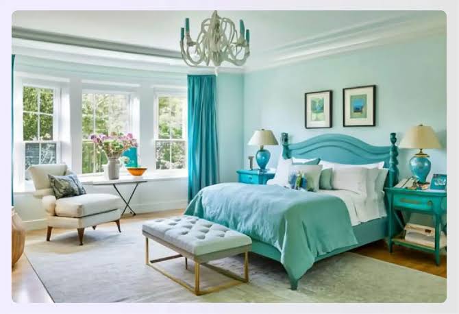
Everyone has an opinion about bedroom colors. Blue is calming. Red is stimulating. Yellow is cheerful but wakes you up. These ideas are repeated so often that they sound like fact. The reality is more nuanced. Color can influence mood and atmosphere, but it is only one small part of what helps you sleep. Still, your bedroom’s palette matters for how restful the space feels, and you can make smart choices without relying on myths.
What the research really says
Studies on color and sleep are limited and sometimes inconsistent. Some surveys have found that people who sleep in blue or green rooms report slightly more sleep on average, but such studies cannot prove cause and effect. Individual responses vary widely, shaped by culture, memories and personal taste. The practical takeaway is that there is no magic color. Choose a palette that makes you feel calm and relaxed, because that feeling is what supports sleep.
Soft blues and greens
Blues and greens are associated with nature, water and sky, so many people find them restful. Pale blue, sage green, soft teal and gray-blue can create a serene mood. If you worry that blue feels cold, choose a version with a hint of green or gray for warmth. These colors pair well with natural wood, white bedding and soft textiles.
Warm neutrals
Beige, greige, warm white, cream and soft taupe form a gentle backdrop that does not demand attention. They reflect light and make a space feel cozy without being overpowering. Neutral does not have to mean boring. Layering textures, such as linen, wool and cotton, brings depth.
Muted earthy tones
Terracotta, clay, dusty rose and muted olive can feel grounding and comforting when used in softened, low-saturation shades. A deeper color on one wall can create a cozy nook, as long as the overall effect is calming. Avoid colors that feel jarring to you.
Dark colors can work, too
A deep navy, charcoal or forest green on the walls can make a bedroom feel enveloping, like a cocoon. Some people sleep better in a dark, cave-like space. The key is lighting, since dark walls absorb light and can make a small, poorly lit room feel gloomy during the day. Use warm lamps, and pair dark walls with lighter bedding and trim.
Colors to use with caution
Highly saturated reds, oranges, bright yellows and neon hues can feel energizing, which may not suit a space for winding down. That does not mean you cannot use them as accents, in a pillow or a piece of art. If you love a bold color, use it in small doses.
Finish and lighting matter
A matte or eggshell finish reduces glare and gives a soft look, which is ideal for a bedroom. High-gloss paint reflects light and can feel harsh. The color of your lightbulbs matters too. Warm white bulbs, around 2700 kelvin, create a relaxing glow and make most bedroom colors look inviting. Cool white or daylight bulbs can make even a calm color feel stark. Dimmers and bedside lamps allow you to lower the light in the evening.
Darkness is more important than paint
If you want to improve your sleep, the most effective step is usually controlling light. Blackout curtains or shades, covering electronic indicator lights and turning off screens before bed help far more than a wall color. Keep the room cool and quiet, and reserve the bed for sleep.
Test before you commit
Paint large samples on the wall and observe them at different times of day. Colors shift with natural and artificial light. Live with the samples for a few days, and notice how you feel in the room in the morning and at night.
Bedding and accessories
If repainting is not an option, bedding, curtains and rugs can shift the palette. A soft, neutral duvet and calming throw pillows can transform the feel of a room. Reduce clutter, which can make the bedroom feel busy.
Rentals and permission
If you rent, check your lease before repainting. Many landlords allow a color change with written permission, sometimes on the condition that you restore the original color when you leave. Keep a record of the paint color and brand used.
A quick recommendation
Pick a color that you find peaceful, use warm lighting, control light and noise, and pay attention to how you feel. That is a much better guide than any rule about which color is scientifically perfect.